
How to Create Interactive Plots in JupyterLab
This post is going to be fairly straight-forward. If you have followed my previous post, we should have a virtual environment with Catalyst ready.
Install Node.js
You can easily install Node.js from the NodeSource repository. Since adding extra repo into Debian is not really recommended by security freaks like me, I would suggest an alternavtive method through npm. Open the terminal
curl -o- https://raw.githubusercontent.com/creationix/nvm/v0.34.0/install.sh | bash
At the end of the installation, close the current terminal and open a new one. Check if npm is properly installed.
npm --version
Great! Let us install the latest LTS node.js
nvm install --lts
If you live on the edge, try this instead.
nvm install node
Install ipympl via pip
Activate our venv
source venv/bin/activate
Install ipympl
(venv) pip install ipympl
(venv) jupyter labextension install @jupyter-widgets/jupyterlab-manager
(venv) jupyter labextension install jupyter-matplotlib
Check if it works
Start JupyterLab from our venv
(venv) jupypter lab
Create a new file and add the following:
%matplotlib widget
from catalyst.api import symbol, record
from catalyst import run_algorithm
import matplotlib.pyplot as plt
import numpy as np
import pandas as pd
import stationarity_test

def initialize(context):
    context.asset = symbol('btc_usdt')

def handle_data(context, data):
    current_price = data.history(context.asset, 'price', 1, '1d')
    record(price=current_price)

if __name__ == '__main__':
    perf = run_algorithm(capital_base=1000,
                          data_frequency='daily',
                          initialize=initialize,
                          handle_data=handle_data,
                          exchange_name='poloniex',
                          quote_currency='usdt',
                          start=pd.to_datetime('2017-11-1', utc=True),
                          end=pd.to_datetime('2018-11-1', utc=True))

# Plots
fig = plt.figure()
ax1 = plt.subplot2grid((1, 1), (0, 0), rowspan=3, colspan=1)
ax1.plot(perf.index, perf.price, label='BTC/USDT')
fig.legend()
plt.show()
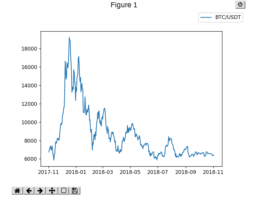
If everyting works, you should see the interactive plot of bitcoin price from 2017/11/01 to 2018/11/01.
That is all for this post. I hope you find something useful in it, and let me know if you have any questions/comments. Feel like stopping by and say hi? Let us talk more about crypto and quantitative trading over there. Here is the discord invite link. Ciao!