
How to Create Bitcoin Logarithmic Price Scale Using Matplotlib
Get Data
Before we can plot the figure, we need to get the data. Again, I am going to use Catalyst to collect Bitcoin price and volume data from Bitfinex.
Start your Jupyter Notebook or JupyterLab, and create a new file.
First, let us import some modules.
# Make interactive plots in JupyterLab
# If you would like to know more, check this post of mine
# https://0xboz.github.io/blog/how-to-create-interactive-plots-in-jupyterlab/
%matplotlib widget
from catalyst.api import symbol, record
from catalyst import run_algorithm
import matplotlib.pyplot as plt
import matplotlib.dates as mdates
from matplotlib import style
from matplotlib import ticker
import numpy as np
import pandas as pd
Next, we need to define a few variables, which will make our life easier when switching to another trading pair or changing some params.
trading_pair = 'btc_usd'
# Catalyst has collected more than 4 years BTC/USD daily and minute data from Bitfinex
exchange = 'bitfinex'
start = '2015-3-2'
end = '2019-6-25'
# We are using the daily data in this tutorial
frequency = 'daily'
capital_base = 1000
quote_currency = trading_pair.split('_')[1]
As usual, we start with initializing the function and tell Catalyst which trading pair we are going to use.
def initialize(context):
    context.asset = symbol(trading_pair)
Then we deploy handle_data() function and record price, volume and other data on the fly. Please note handle_data() runs every minute, it is recommended to use schedule function instead if your algo doesn’t need that luxury computation. Later you can shorten the time window (say a few weeks) and try it out with frequency = 'minute' and tell me what you have found in case your computer doesn’t crash.
def handle_data(context, data):
    # The last known price and volume of current date/minute and the day/minute before
    if frequency == 'daily':
        previous_price, current_price = data.history(
            context.asset, 'price', 2, '1d')
        volume = data.current(context.asset, 'volume')
    elif frequency == 'minute':
        previous_price, current_price = data.history(
            context.asset, 'price', 2, '1T')
        volume = data.current(context.asset, 'volume')
    # Calculate rate of return
    simple_return = current_price / previous_price - 1
    # Calculate log return
    log_return = np.log(current_price) - np.log(previous_price)
    record(price=current_price, simple_return=simple_return, log_return=log_return, volume=volume)
One more thing, let us set up __name__ == '__main__'.
if __name__ == '__main__':
    perf = run_algorithm(capital_base=capital_base,
                         data_frequency=frequency,
                         initialize=initialize,
                         handle_data=handle_data,
                         exchange_name=exchange,
                         quote_currency=quote_currency,
                         start=pd.to_datetime(start, utc=True),
                         end=pd.to_datetime(end, utc=True))
Awesome! But before we run our algo, we need to ingest the data first.
(venv) catalyst ingest-exchange -x bitfinex -f daily -i btc_usd
Just in case you would like to run it on minute data, don’t forget to run this command.
(venv) catalyst ingest-exchange -x bitfinex -f minute -i btc_usd
Okay, now let us go back to our coding cell and run the script by Shift + Enter or Ctrl + Enter. If you happen to see the following, meaning we can move onto the next step - plotting!
Matplotlib
Since we have already imported matplotlib, let us jump right into plotting this time.
# Plot style and figure size
style.use('fivethirtyeight')
fig = plt.figure(figsize=(12,18))
Okay, now the fun part begins. First, we are going have plot a regular price chart for Bitcoin.
# Price Chart
ax = plt.subplot2grid((20, 1), (0, 0), rowspan=7, colspan=1)
ax.plot(perf.index, perf.price, color='k', linewidth=0.75)
ax.yaxis.set_major_locator(plt.MaxNLocator(10))
ax.yaxis.set_major_formatter(ticker.FormatStrFormatter('$%.2f'))
ax.yaxis.set_minor_formatter(ticker.FormatStrFormatter('$%.2f'))
ax.set_ylim([0, np.max(perf.price) * 1.1])
plt.ylabel('Price', fontsize=10)
plt.yticks(fontsize=7)
title = (' / '.join(trading_pair.split('_'))).upper() + ' ' + frequency.title()
plt.title(title, fontsize=12)
plt.grid(which='minor')
plt.setp(ax.get_xticklabels(), visible=False)
bbox_props = dict(boxstyle='round',fc='w', ec='k',lw=0.25)
ax.annotate(str(perf.price[-1]), (perf.index[-1], perf.price[-1]),
            xytext = (perf.index[-1] + pd.Timedelta('14d'), perf.price[-1]),
            bbox=bbox_props, fontsize=5)
And here is the volume part.
# Volume in Price Chart
axv = ax.twinx()
axv.set_ylim([0, np.max(perf.volume) * 2])
axv.bar(perf.index, perf.volume, color='#0079a3', alpha=0.4)
plt.grid(False)
plt.setp(axv.get_yticklabels(), visible=False)
Thanks to matplotlib, it is quite easy convert price to logarithmic scale from the code above.
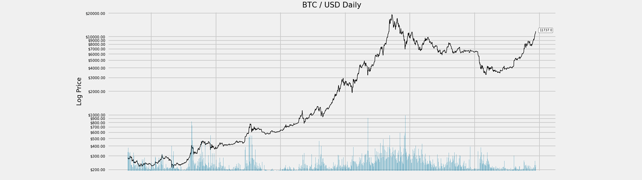
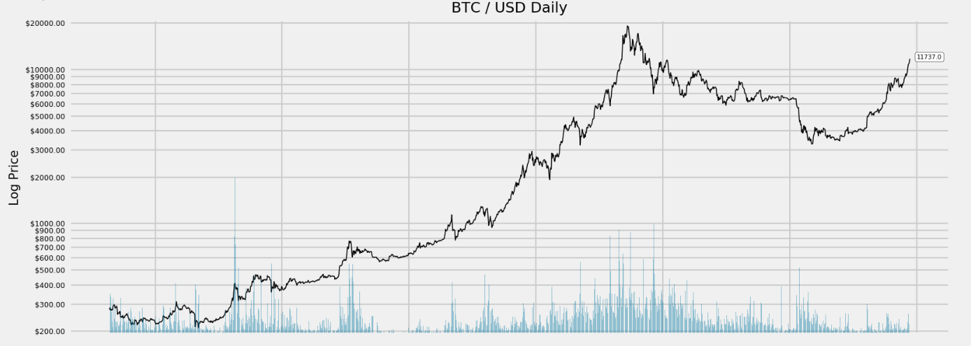
# Log Price Chart
ax1 = plt.subplot2grid((20, 1), (7, 0), rowspan=7, colspan=1, sharex=ax)
ax1.semilogy(perf.index, perf.price, basey=10, color='k', linewidth=0.75)
ax1.yaxis.set_major_formatter(ticker.FormatStrFormatter('$%.2f'))
ax1.yaxis.set_minor_formatter(ticker.FormatStrFormatter('$%.2f'))
ax1.set_ylim([np.min(perf.price) * 0.9, np.max(perf.price) * 1.1])
plt.ylabel('Log Price', fontsize=10)
ax1.tick_params(axis='y', which='both', labelsize=6)
plt.grid(which='minor')
plt.setp(ax1.get_xticklabels(), visible=False)
bbox_props = dict(boxstyle='round',fc='w', ec='k',lw=0.25)
ax1.annotate(str(perf.price[-1]), (perf.index[-1], perf.price[-1]),
            xytext = (perf.index[-1] + pd.Timedelta('14d'), perf.price[-1]),
            bbox=bbox_props, fontsize=5)
plt.title(title, fontsize=12)

# Volume in Log Price Chart
ax1v = ax1.twinx()
ax1v.set_ylim([0, np.max(perf.volume) * 2])
ax1v.bar(perf.index, perf.volume, color='#0079a3', alpha=0.4)
plt.grid(False)
plt.setp(ax1v.get_yticklabels(), visible=False)
Here is what it looks like.
As a bonus, let us re-visit the discussion about Stationarity and Differencing on crypto trading data. The code below is going to generate daily log return time series chart.
# Log Return Chart
ax2 = plt.subplot2grid((20, 1), (14, 0), rowspan=6, colspan=1, sharex=ax)
ax2.plot(perf.index, perf.log_return, color='g', linewidth=0.25)
ax2.xaxis.set_major_locator(plt.MaxNLocator(7))
ax2.yaxis.set_major_formatter(ticker.FormatStrFormatter('%.3f'))
ax2.set_ylim([-0.3, 0.3])
ax2.yaxis.set_minor_locator(ticker.AutoMinorLocator(2))
plt.ylabel('Log Return', fontsize=10)
plt.yticks(fontsize=7)
plt.xticks(fontsize=10, rotation=0)
plt.grid(which='minor')
xfmt = mdates.DateFormatter('%d-%m-%y')
ax2.xaxis.set_major_formatter(xfmt)
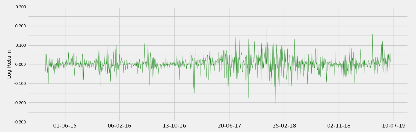
From the chart above, we can observe the mean and variance are relatively constant over time. In the upcoming post, I will cover how to utilize this data with integration of order zero I(0) for our trading model.
We still need a few more lines of code to adjust those sub plots.
plt.subplots_adjust(left=0.1, bottom=0.05, right=0.94, top=0.96, wspace=0.2, hspace=1)
plt.show()
Send me a message if you have any questions/comments. Feel like stopping by and say hi? Let us talk more about crypto and quantitative trading over there. Here is the discord invite link.
Stay calm and happy trading!