

How to Create ARIMA Model Forecasting BTCUSD in Python Part 1
In my previous posts, we have discussed stationarity tests on crypto trading data. In this upcoming series, we are going to explore how to implement Autoregressive Integrated Moving Average Model (ARIMA) into our crypto quantitative analysis.
The following material is for educational purposes only. Do NOT use it in production or bid with real money.
ARIMA
ARIMA is a general class of statistical models for analyzing and forecasting time series data. It includes random walk, moving average, seasonal and non-seasonal exponential smoothing and autoregressive models. One of the good places to start learning the fundamental theory is Prof. Nau’s course notes and materials, which provides a deep dive into time series analysis, explaining every aspect in detail.
BTCUSD Trading Data
Again, we are using Catalyst to pull out BTCUSD trading data from 2015-3-3 to 2019-6-25. In your terminal, run this command to ingest the data we need for this post.
(venv) catalyst ingest-exchange -x bitfinex -f daily -i btc_usd
If you haven’t installed Catalyst yet, take a look at this post and come back later.
Great! Let us create a new file named ARIMA.ipynb with JuypterLab or Juypter Notebook. Add the following code and hit Shift + Enter
%matplotlib inline
# Increase chart resolution
%config InlineBackend.figure_format = 'retina'

from catalyst.api import symbol, record
from catalyst import run_algorithm

from datetime import timedelta

from itertools import product

import matplotlib.pyplot as plt
import matplotlib.patches as mpatches
import matplotlib.lines as mlines
from matplotlib import style
from matplotlib import ticker

import numpy as np
import pandas as pd

from scipy import stats
import seaborn as sns

from statsmodels.tsa.statespace.sarimax import SARIMAX
from statsmodels.tsa.stattools import adfuller

import warnings
warnings.filterwarnings('ignore')

trading_pair = 'btc_usd'
frequency = 'daily'
exchange = 'bitfinex'
start = '2015-3-3'
end = '2019-6-25'
capital_base = 1000
quote_currency = trading_pair.split('_')[1]

def initialize(context):
    context.asset = symbol(trading_pair)

def handle_data(context, data):

    # The last known price and volume of current date/minute and the day/minute before
    if frequency == 'daily':
        price = data.current(context.asset, 'price')
        volume = data.current(context.asset, 'volume')
    elif frequency == 'minute':
        price = data.current(context.asset, 'price')
        volume = data.current(context.asset, 'volume')

    record(price=price, volume=volume)

if __name__ == '__main__':
    perf = run_algorithm(capital_base=capital_base,
                         data_frequency=frequency,
                         initialize=initialize,
                         handle_data=handle_data,
                         exchange_name=exchange,
                         quote_currency=quote_currency,
                         start=pd.to_datetime(start, utc=True),
                         end=pd.to_datetime(end, utc=True))
The daily (close) price and volume are stored in perf (performance). Let us resample our data into daily, weekly, bi-weekly and monthly data sets.
# Daily data
d_df = pd.DataFrame(perf.loc[:, ['price', 'volume']], index=perf.index).resample('1d').mean().round(2).copy()

# Weekly data
w_df = d_df.resample('1w').mean().round(2).copy()

# Bi-weekly data
bw_df = d_df.resample('2w').mean().round(2).copy()

# Monthly data
m_df = d_df.resample('1M').mean().round(2).copy()

df_list = [d_df, w_df, bw_df, m_df]
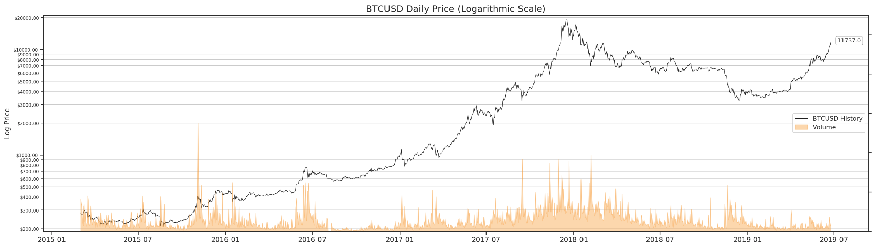
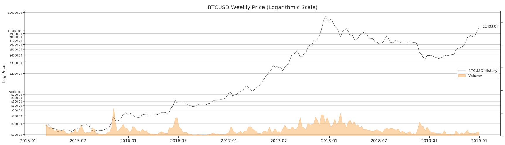
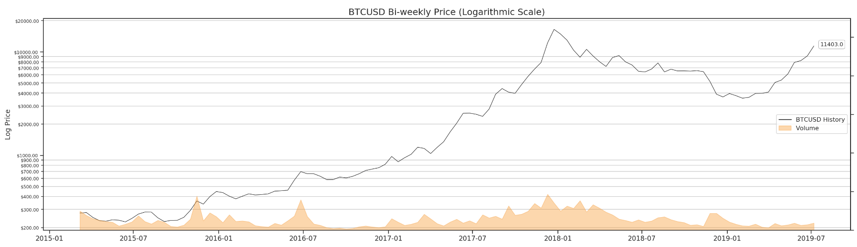
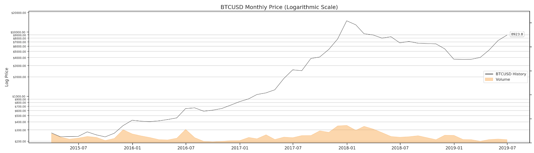
Logarithmic Price Chart
You might be curious about what they look like. Remember the logarithmic price scale discussed in my previous post? We can create a similar function and take a quick look at what we have from the resampling.
Further, we are going to use this very same function to compare our forecast with history price at the end of this series. It is totally okay if you can not understand some parts of this function at the moment. I will do my best to explain them in detail.
def make_log_price_chart(df, frequency='Daily'):
    """
    Plot in logarithmic price scale
    """
    sns.set(style="ticks")
    fig_log_price = plt.figure(figsize=(26,7))
We are going to use seaborn ticks style. I have set up the figure size based on my screen. Feel free to change it to your liking. In case you need to install seaborn, run this command in the terminal
(venv) pip install -U seachborn
Now we need to check the data frequency once the function has taken in the panda dataframe, and we are going to use this frequency information to plot the figure accordingly.
    # Data Frequency
    if 'Day' in str(df.index.freq):
        frequency = 'Daily'
    elif 'Week: weekday=6' in str(df.index.freq):
        frequency = 'Weekly'
    elif '2 * Weeks: weekday=6' in str(df.index.freq):
        frequency = 'Bi-weekly'
    elif 'MonthEnd' in str(df.index.freq):
        frequency = 'Monthly'
Let us create the first subplot for the price data.
    # History Price
    ax1 = plt.subplot2grid((1, 1), (0, 0), rowspan=1, colspan=1)
If there is only history price, we are going to use line chart. At the end of this series, the data frame will contain forecast as well. In that case, the function uses scatter chart to plot the history price instead.
    if 'forecast' in df.columns:
        ax1.semilogy(df.index, df.price, basey=10, color='k', linewidth=0, marker='.')
        lg_price = mlines.Line2D([], [], color='k', label='BTCUSD History', linewidth=0, marker='.')

    else:
        ax1.semilogy(df.index, df.price, basey=10, color='k', linewidth=0.75)
        lg_price = mlines.Line2D([], [], color='k', label='BTCUSD History', linewidth=1.5)
More format tweeks for the price chart.
    ax1.yaxis.set_major_formatter(ticker.FormatStrFormatter('$%.2f'))
    ax1.yaxis.set_minor_formatter(ticker.FormatStrFormatter('$%.2f'))
    ax1.set_ylim([np.min(perf.price) * 0.9, np.max(perf.price) * 1.1])
    plt.ylabel('Log Price', fontsize=12)
    ax1.tick_params(axis='y', which='both', labelsize=8)
    plt.grid(which='minor')
    plt.xticks(fontsize=12, rotation=0)
Now, we can work on the second subplot - volume.
    # Volume in Log Price Chart
    ax1v = ax1.twinx()
    ax1v.set_ylim([0, np.max(perf.volume) * 2])
    ax1v.fill_between(df.index, df.volume, color='#F89E38', alpha=0.4, label='2')
    plt.grid(False)
    plt.setp(ax1v.get_yticklabels(), visible=False)
    lg_volume = mpatches.Patch(color='#F89E38', label='Volume', alpha=0.4)
Here comes the forecast part. We will show the last forecast price on the right in a annotation green box. In case of history price only, the chart presents the last known price in a white box. In addition, the 95% confidence interval (upper & lower) will be plotted in red.
    if 'forecast' in df.columns:

        # Forecast Price
        ax1.semilogy(df.index, df.forecast, basey=10, color='g', linewidth=0.75)

        # Forecast Price Annotation
        bbox_props = dict(boxstyle='round',fc='g', ec='k',lw=0.25)
        last_forecast_price_date = df.forecast.last_valid_index()
        last_forecast_price_index = df.index.get_loc(last_forecast_price_date)
        last_forecast_price = df.forecast.iloc[last_forecast_price_index]
        ax1.annotate(str(last_forecast_price), (last_forecast_price_date, last_forecast_price),
                    xytext = (last_forecast_price_date + pd.Timedelta('7d'), last_forecast_price),
                    bbox=bbox_props, fontsize=10)

        # Plot confidence interval
        first_forecast_price_date = df.forecast.first_valid_index()
        first_forecast_price_index = df.index.get_loc(first_forecast_price_date)
        ax1.fill_between(df.index[first_forecast_price_index:],
                         df['upper forecast'].iloc[first_forecast_price_index:],
                         df['lower forecast'].iloc[first_forecast_price_index:],
                         color='r',
                         alpha=0.2)

        ax1.yaxis.set_major_formatter(ticker.FormatStrFormatter('$%.2f'))
        ax1.yaxis.set_minor_formatter(ticker.FormatStrFormatter('$%.2f'))

        lg_forecast = mlines.Line2D([], [], color='g', label='BTCUSD Forecast', linewidth=1.5)
        lg_forecast_ci = mpatches.Patch(color='r', label='95% Confidence Interval', alpha=0.2)
        plt.legend(handles=[lg_price, lg_forecast, lg_volume, lg_forecast_ci], loc='center right')
    else:
        # History Price Annotation
        bbox_props = dict(boxstyle='round',fc='w', ec='k', lw=0.25)
        last_known_price_date = df.price.last_valid_index()
        last_known_price_index = df.index.get_loc(last_known_price_date)
        last_known_price = df.price.iloc[last_known_price_index]
        ax1.annotate(str(last_known_price), (last_known_price_date, last_known_price),
                    xytext = (last_known_price_date + pd.Timedelta('14d'), last_known_price),
                    bbox=bbox_props, fontsize=10)
        plt.legend(handles=[lg_price, lg_volume], loc='center right')
Put everything together for make_log_price_chart(), and we have got the following.
def make_log_price_chart(df, frequency='Daily'):
    """
    Plot in logarithmic price scale
    """
    sns.set(style="ticks")
    fig_log_price = plt.figure(figsize=(26,7))

    # Data Frequency
    if 'Day' in str(df.index.freq):
        frequency = 'Daily'
    elif 'Week: weekday=6' in str(df.index.freq):
        frequency = 'Weekly'
    elif '2 * Weeks: weekday=6' in str(df.index.freq):
        frequency = 'Bi-weekly'
    elif 'MonthEnd' in str(df.index.freq):
        frequency = 'Monthly'

    # History Price
    ax1 = plt.subplot2grid((1, 1), (0, 0), rowspan=1, colspan=1)

    if 'forecast' in df.columns:
        ax1.semilogy(df.index, df.price, basey=10, color='k', linewidth=0, marker='.')
        lg_price = mlines.Line2D([], [], color='k', label='BTCUSD History', linewidth=0, marker='.')

    else:
        ax1.semilogy(df.index, df.price, basey=10, color='k', linewidth=0.75)
        lg_price = mlines.Line2D([], [], color='k', label='BTCUSD History', linewidth=1.5)

    ax1.yaxis.set_major_formatter(ticker.FormatStrFormatter('$%.2f'))
    ax1.yaxis.set_minor_formatter(ticker.FormatStrFormatter('$%.2f'))
    ax1.set_ylim([np.min(perf.price) * 0.9, np.max(perf.price) * 1.1])
    plt.ylabel('Log Price', fontsize=12)
    ax1.tick_params(axis='y', which='both', labelsize=8)
    plt.grid(which='minor')
    plt.xticks(fontsize=12, rotation=0)

    # Volume in Log Price Chart
    ax1v = ax1.twinx()
    ax1v.set_ylim([0, np.max(perf.volume) * 2])
    ax1v.fill_between(df.index, df.volume, color='#F89E38', alpha=0.4, label='2')
    plt.grid(False)
    plt.setp(ax1v.get_yticklabels(), visible=False)
    lg_volume = mpatches.Patch(color='#F89E38', label='Volume', alpha=0.4)

    if 'forecast' in df.columns:

        # Forecast Price
        ax1.semilogy(df.index, df.forecast, basey=10, color='g', linewidth=0.75)

        # Forecast Price Annotation
        bbox_props = dict(boxstyle='round',fc='g', ec='k',lw=0.25)
        last_forecast_price_date = df.forecast.last_valid_index()
        last_forecast_price_index = df.index.get_loc(last_forecast_price_date)
        last_forecast_price = df.forecast.iloc[last_forecast_price_index]
        ax1.annotate(str(last_forecast_price), (last_forecast_price_date, last_forecast_price),
                    xytext = (last_forecast_price_date + pd.Timedelta('7d'), last_forecast_price),
                    bbox=bbox_props, fontsize=10)

        # Plot confidence interval
        first_forecast_price_date = df.forecast.first_valid_index()
        first_forecast_price_index = df.index.get_loc(first_forecast_price_date)
        ax1.fill_between(df.index[first_forecast_price_index:],
                         df['upper forecast'].iloc[first_forecast_price_index:],
                         df['lower forecast'].iloc[first_forecast_price_index:],
                         color='r',
                         alpha=0.2)

        ax1.yaxis.set_major_formatter(ticker.FormatStrFormatter('$%.2f'))
        ax1.yaxis.set_minor_formatter(ticker.FormatStrFormatter('$%.2f'))

        lg_forecast = mlines.Line2D([], [], color='g', label='BTCUSD Forecast', linewidth=1.5)
        lg_forecast_ci = mpatches.Patch(color='r', label='95% Confidence Interval', alpha=0.2)
        plt.legend(handles=[lg_price, lg_forecast, lg_volume, lg_forecast_ci], loc='center right')
    else:
        # History Price Annotation
        bbox_props = dict(boxstyle='round',fc='w', ec='k', lw=0.25)
        last_known_price_date = df.price.last_valid_index()
        last_known_price_index = df.index.get_loc(last_known_price_date)
        last_known_price = df.price.iloc[last_known_price_index]
        ax1.annotate(str(last_known_price), (last_known_price_date, last_known_price),
                    xytext = (last_known_price_date + pd.Timedelta('14d'), last_known_price),
                    bbox=bbox_props, fontsize=10)
        plt.legend(handles=[lg_price, lg_volume], loc='center right')

    title = 'BTCUSD {} Price (Logarithmic Scale)'.format(frequency)
    plt.title(title, fontsize=16)
    plt.show()
Awesome. Let us use this function to run through our data frame list including daily, weekly, bi-weekly and monthly BTCUSD history prices.
for df in df_list:
    make_log_price_chart(df)
Stationarity Test
Apparently, our price data is not stationary. But before we perform any data transformation and differencing, we can create a simple stationarity test function (You might have noticed this function is a bit similar to the one mentioned in one of my previous posts) for later use.
def run_stationarity_test(time_series, window=10):
    """
    This window here is a bit arbitrary.
    After all, rolling average is just a visual technique to verify the stationarity.
    """
    sns.set(style="darkgrid")
    #Determing rolling statistics
    rolmean = time_series.rolling(window=window).mean()
    rolstd = time_series.rolling(window=window).std()

    #Plot rolling statistics:
    fig = plt.figure(figsize=(27, 5))
    orig = plt.semilogy(time_series, color='blue',label='Original', lw=0.75, alpha=0.7)
    mean = plt.semilogy(rolmean, color='red', label='Rolling Mean', lw=1)
    std = plt.semilogy(rolstd, color='black', label = 'Rolling Std', lw=1)
    plt.legend(loc='best')

    if 'Day' in str(time_series.index.freq):
        freq = 'Daily'
    elif 'Week: weekday=6' in str(time_series.index.freq):
        freq = 'Weekly'
    elif '2 * Weeks: weekday=6' in str(time_series.index.freq):
        freq = 'Bi-weekly'
    elif 'MonthEnd' in str(time_series.index.freq):
        freq = 'Monthly'

    plt.title('{} Data Rolling Mean & Standard Deviation'.format(freq), fontsize=20)
    plt.yticks(fontsize=14)
    plt.xticks(fontsize=14, rotation=0)
    plt.show()

    #Perform ADF test:
    first_valid_date = time_series.first_valid_index()
    print('Results of ADF Test:')
    dftest = adfuller(time_series.loc[first_valid_date:], autolag='AIC')
    dfoutput = pd.Series(dftest[0:4], index=['Test Statistic','p-value','#Lags Used','Number of Observations Used'])
    for key,value in dftest[4].items():
        dfoutput['Critical Value (%s)'%key] = value
    print(dfoutput)
Let us run this test through our data frame list as well.
for df in df_list:
    run_stationarity_test(df.price)
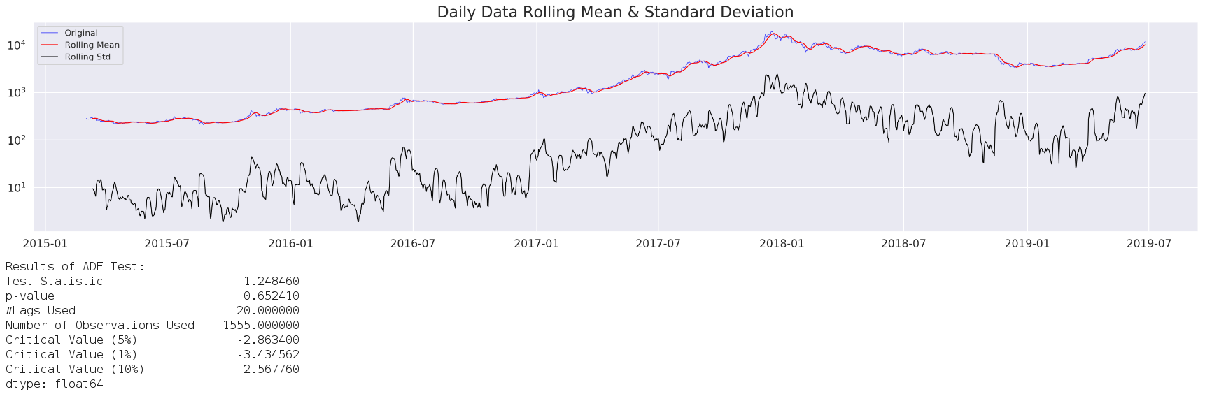
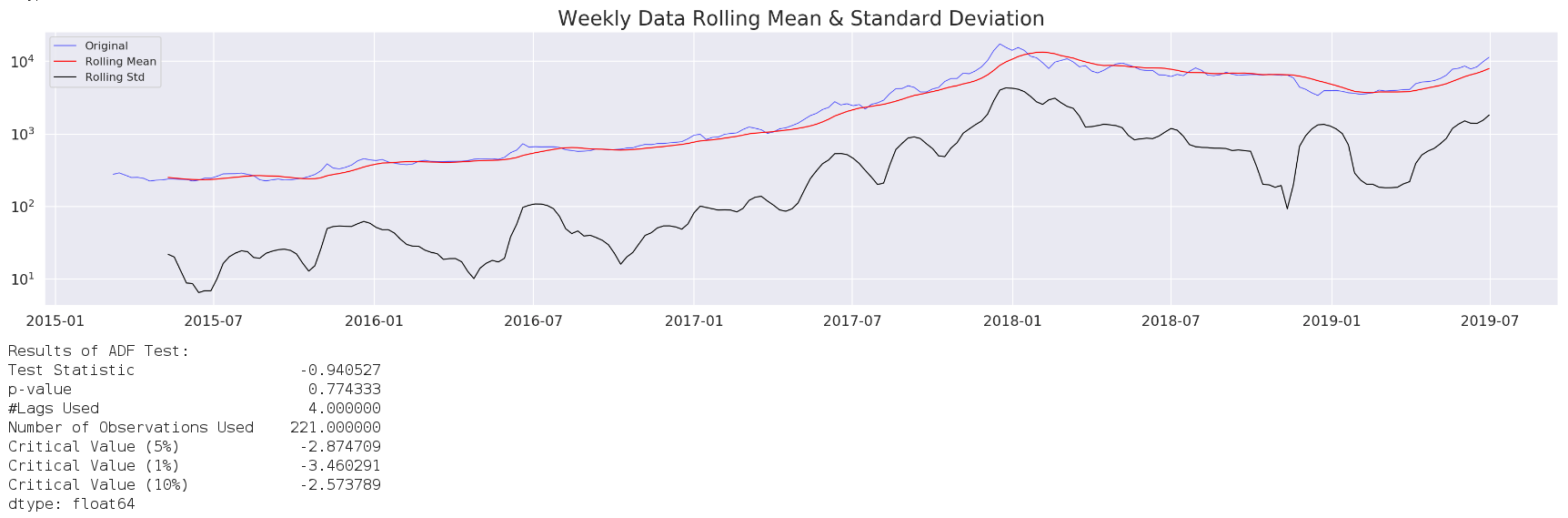
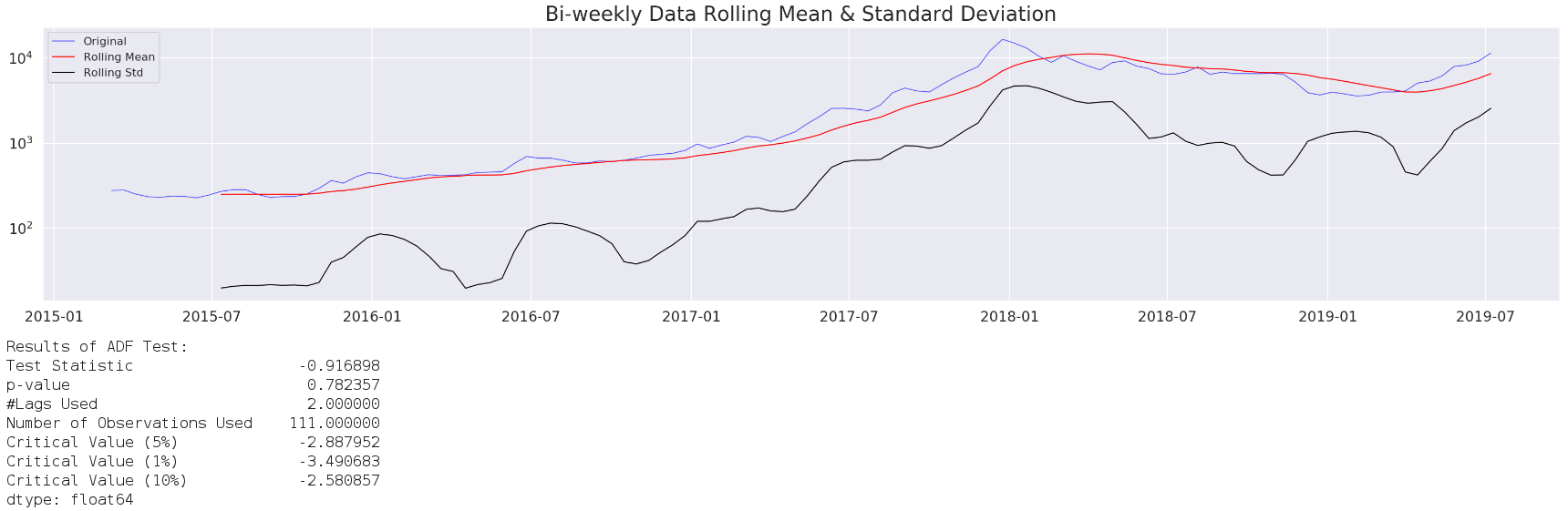
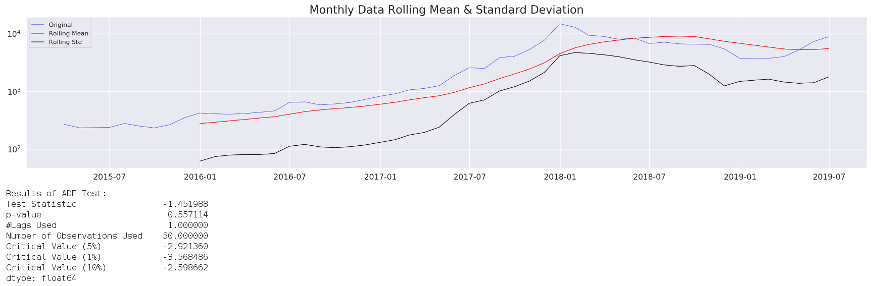
Visually speaking, it is quite obvious that our price data is not stationary.
According to Augmented Dickey-Fuller (ADF) test, when p-value is greater than 0.05, we can not reject the null hypothesis that the series has a unit root. In other words, the price time series is not stationary.
Usually, we can just take the natural log of the price and be done with it, but I am going to show you another general yet powerful tool called Box-Cox Transformation in the upcoming part 2. All source code can be found on my github. Meanwhile, if you have any questions/comments/proposals, feel free to shoot me a message.
I have also created one QUANT channel in one of the most popular discords in cryptoverse. Stop by and say hi to those down-to-earth crypto folks.
Stay calm and happy trading!